Cultural Filter - Designing a Better Way to Explore Cultural Heritage
Cultural Filter - Designing a Better Way to Explore Cultural Heritage
Brought 75+ cultural institutions into one platform, improving discovery for locals and visitors and creating a reusable design system.
Brought 75+ cultural institutions into one platform, improving discovery for locals and visitors and creating a reusable design system.


Problem
Bucharest's cultural scene is dispersed across diverse venues, making it difficult for residents and tourists to find comprehensive information and easily navigate the city’s rich cultural offerings. This fragmentation hinders users from fully engaging with the city’s heritage and discovering cultural experiences.
My role
I partnered with Aria 11, a Bucharest-based architecture studio, to design "Cultural Filter Bucharest," a state-funded project addressing this issue. Leading the entire design process, I created a responsive platform that centralizes Bucharest's cultural landmarks, making them accessible to both locals and tourists.
In this role, I advocated for the value of thoughtful design to stakeholders, navigating tight timelines and limited resources to ensure a high-quality user experience. From branding to UX/UI design, I delivered an intuitive and visually engaging platform that connects users to the city's cultural heritage.
Website Linkfiltrucultural.roMy contribution:UX Design, Branding, QA Testing, WorkshopsTeam2 founders, 1 developerTimeline5 month from concept to handoff, 2024
The Impact I Achieved


First challenge - How I Made Navigation Seamless and Accessible for Everyone.. or so i thought
First challenge - How I Made Navigation Seamless and Accessible for Everyone.. or so i thought
Imagine arriving in Bucharest, eager to explore its cultural and architectural gems, but unsure where to start. The interactive map I designed solves this problem by centralizing over 100 cultural spaces into one intuitive platform. Tourists and less tech-savvy locals alike can easily navigate the city’s offerings.
To ensure easy navigation, I focused on two main objectives:
Filter Categories: Users can quickly find cultural spaces, such as historical landmarks or art galleries, through 12 predefined filters.
Deep Filtering: Advanced search options allow users to refine their searches for a more personalized experience.
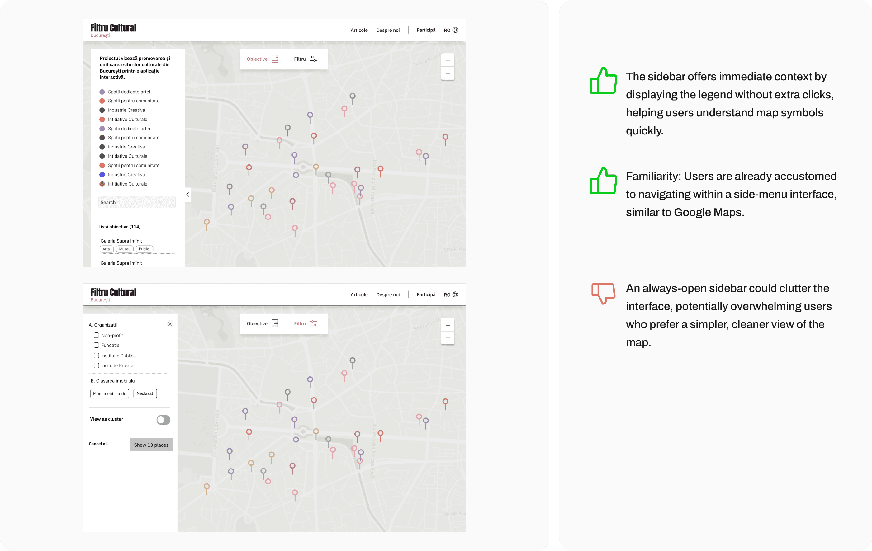
Concept 1: Floating menu
Concept 1: Floating menu
Layout: The two filters are placed in a floating menu.
User Interaction: Users can click on the menu to open a dialogue box with filtering options.
By keeping the filters readily accessible in a non-intrusive way, users can seamlessly explore Bucharest’s diverse cultural offerings while retaining focus on the map itself.


Concept 2: Map Legend Open by Default Sidebar Navigation
Layout: Legend open by default
User Interaction: Provides users with immediate context by displaying the meanings of colored pins without requiring additional clicks.
This approach leverages familiarity, as many users are accustomed to similar interfaces in popular apps like Google Maps, making it intuitive and easy to use.


When the Navigation Menu Fell Short: A Quick Redesign for Accessibility
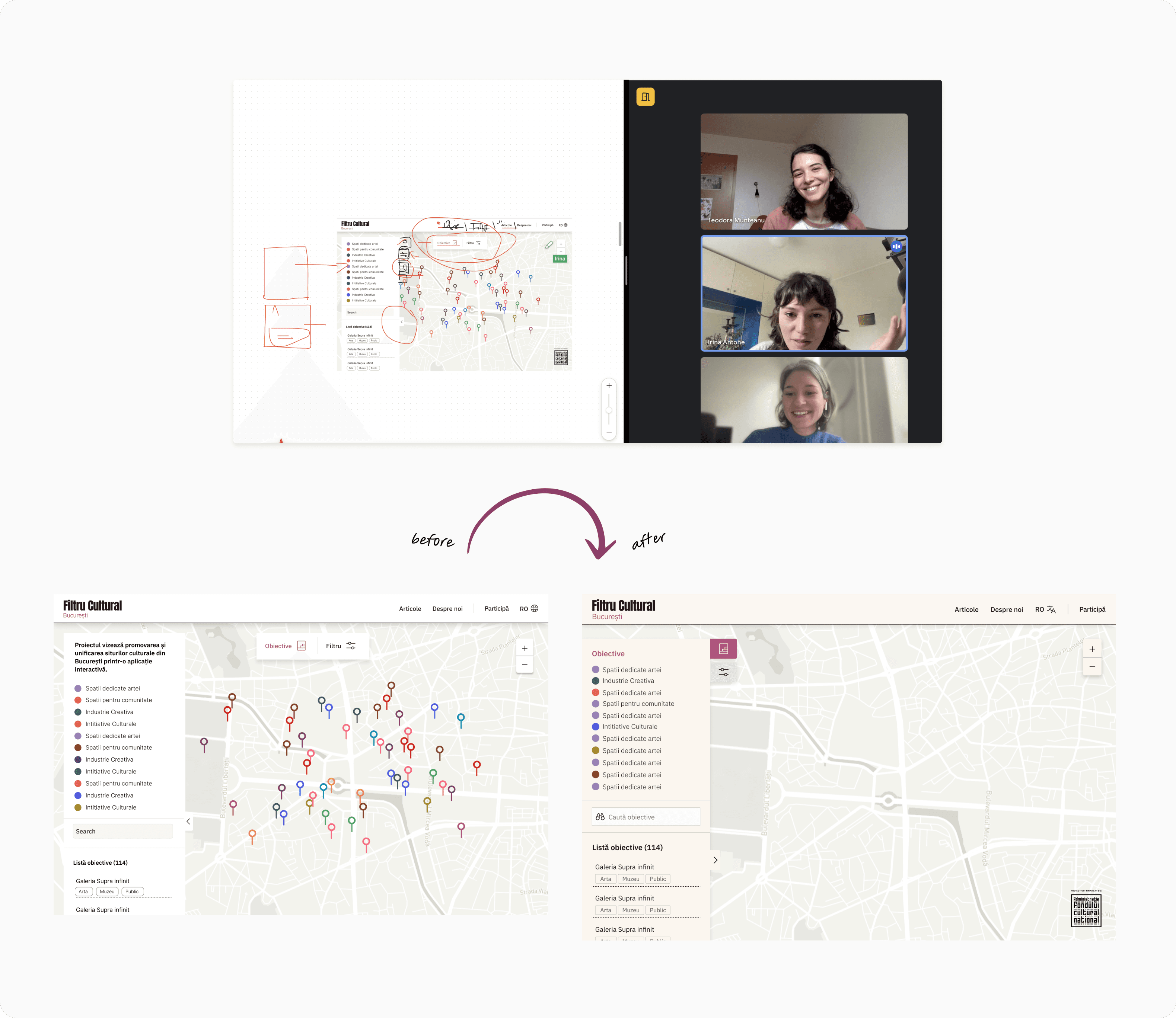
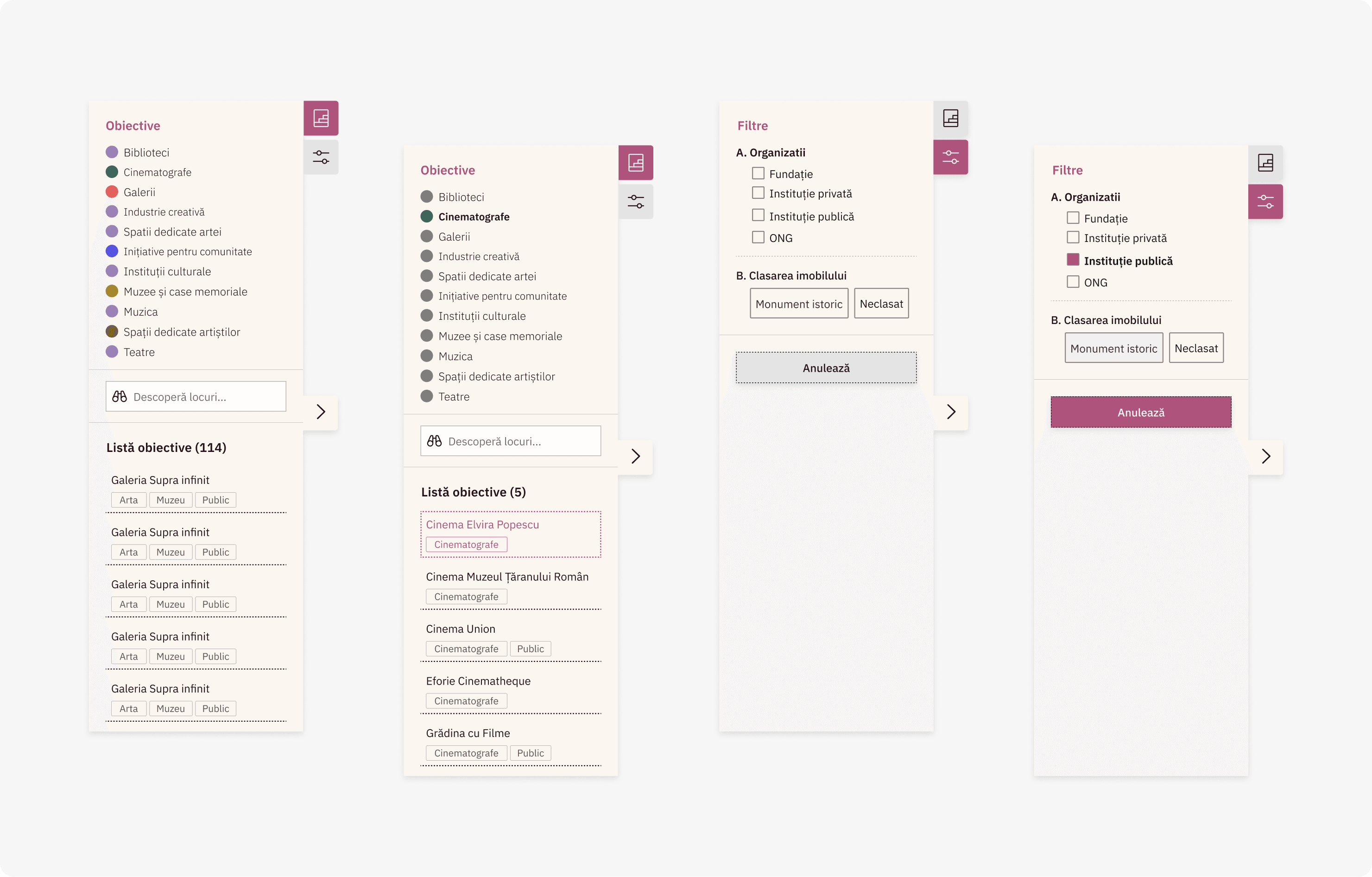
We initially chose the minimalist approach to keep the map interface clean. However, I realized that this design might confuse less tech-savvy users who needed easy access to filter options, a crucial feature for navigating cultural spaces on the map. To ensure we were on the right track, I organized workshops with the founders and the developer to gather feedback and co-create solutions.
We initially chose the minimalist approach to keep the map interface clean. However, I realized that this design might confuse less tech-savvy users who needed easy access to filter options, a crucial feature for navigating cultural spaces on the map. To ensure we were on the right track, I organized workshops with the founders and the developer to gather feedback and co-create solutions.




Second Challenge - Simplifying Information Cards for Better Mobile Experience
Second Challenge - Simplifying Information Cards for Better Mobile Experience
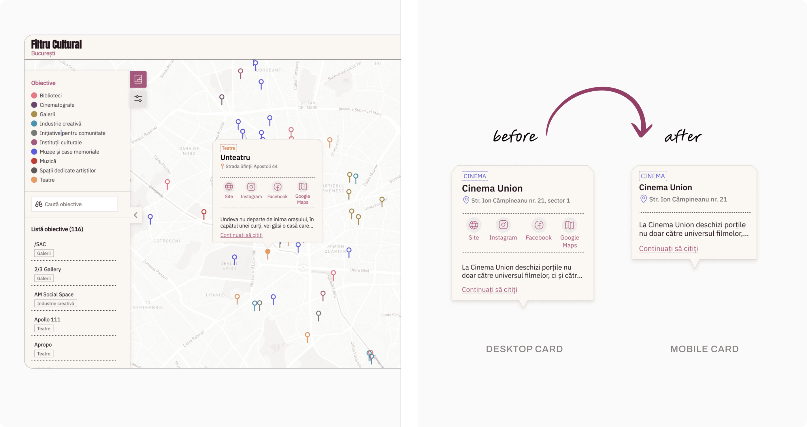
After discussing the mobile UI with the developer, we realized after implementation that the information cards displayed when tapping map pins were overcrowded, making them hard to use on smaller screens.
To resolve this, we brainstormed the core action we wanted users to take and decided to remove unnecessary icons, prioritizing key information about the place. This made the information clearer and improved the overall mobile navigation experience.


Building a Strong Developer Partnership from Day One
An exciting challenge was building a collaborative framework with a developer who hadn’t worked with a designer before. I engaged them from the start, regularly discussing design solutions and brainstorming together. This close collaboration ensured they understood each design detail. I also helped troubleshoot bugs post-implementation, ensuring a smooth development process and successful launch.
An exciting challenge was building a collaborative framework with a developer who hadn’t worked with a designer before. I engaged them from the start, regularly discussing design solutions and brainstorming together. This close collaboration ensured they understood each design detail. I also helped troubleshoot bugs post-implementation, ensuring a smooth development process and successful launch.
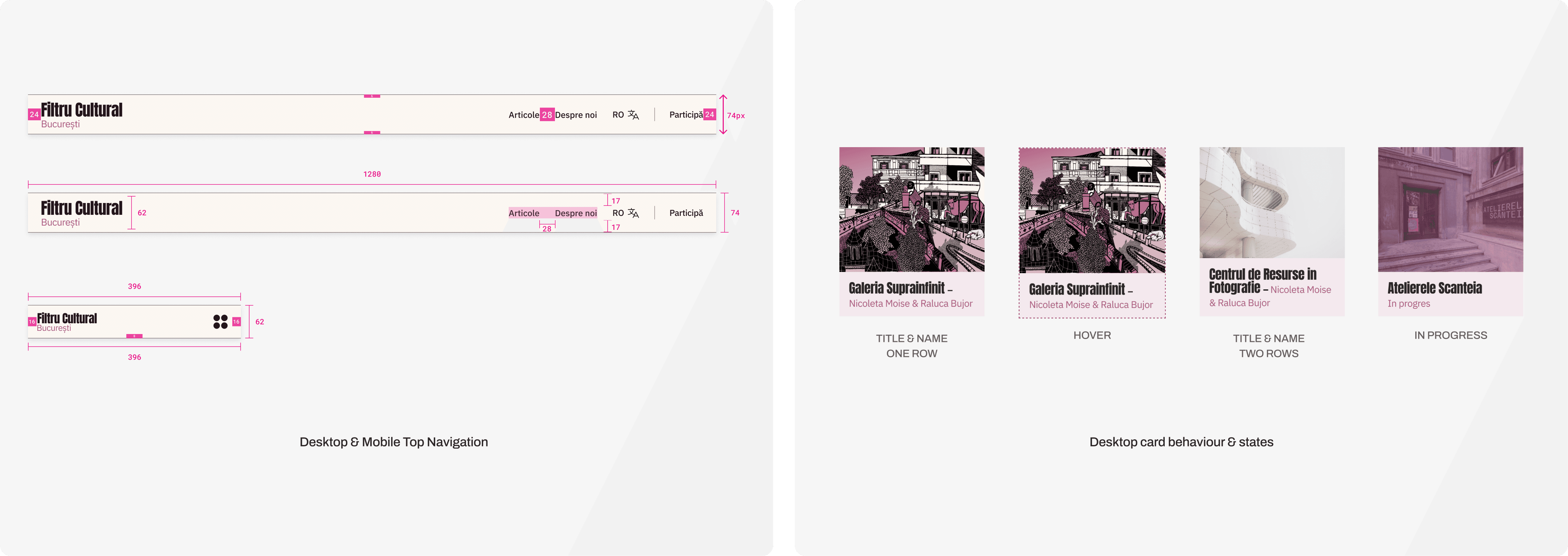


Delighting Users by Evoking the Charm of Paper Maps Online
Being a state-funded cultural project, the design needed to be both visually appealing and accessible. I took inspiration from traditional paper maps, adding tactile elements like folded card shapes and borders, while ensuring accessibility through high-contrast colors and readable fonts.
To enhance the user experience, I collaborated with an illustrator to create Tomită, a character who adds personality and guides users as they explore the platform.


Behind the scene - Learnings
For this initial launch, my focus was on creating a functional and visually appealing platform. This success led to further funding, allowing us to plan for expansion into other cities with rich architectural histories.
Moving forward, we’ll track metrics like user engagement, filter usage, and return rates to ensure the platform continues to evolve based on user needs.
Underneath are 3 main takeaways and lessons that will guide me moving forward.


Let's create thoughtful experiences, with care and intention,together.
Reach out 👋🏼 bianca.ioana.basan *at* gmail.com


Let's create thoughtful experiences, with care and intention,together.
Reach out 👋🏼 bianca.ioana.basan *at* gmail.com


Let's create thoughtful experiences,with care and intention, together.
Reach out 👋🏼 bianca.ioana.basan *at* gmail.com